Welcome to my big blog
On several occasions has there been a thought I would like to write down somewhere, and/or tell people about. Therefore I created two blogs
. The small blog is for small tiny plain text thoughts, and this one is for big thoughts with images and such.
2025-06-02: Small pixel fonts
I like trying to write legibly (or just prettily) on very small resolutions. There's something about the aesthetics and the fun problem solving that really appeals to me. If we're ignoring the distinction between upper- and lowercase, I believe 3x3 is the smallest legible size per letter for English. M, W, and G don't read well in 3x3, but you can get used to them, especially in context. 3x2 and 2x3 are both too small to fit many important features. There are still enough bits to represent each letter, so it's theoretically possible, but you couldn't read it without first learning the letters.
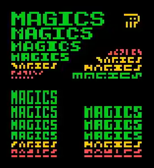
Here's an experiment I did! I made four categories of letter sizes: x*x, 3*x, x*3, and 4*x. In every size I attempted to write Magics
as legibly as possible (when possible I also aim for aesthetics but that's not the main concern in this case). The text that's readable according to me is colored green, and the illegible text is red. The yellow ones are on the edge of what can be read. The conclusion that can be drawn here is that two pixels isn't enough for width or height. Therefore, 3x3 is still the smallest option.
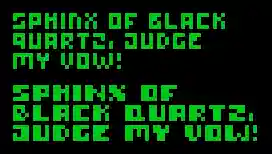
If you want to be as tiny as possible with your pixel text, I recommend 3x3. If you want to be tiny but more readable, 4x4 or 3x4 are good options. In most cases however, don't limit yourself to monospaced type. The M and W deserve to be bigger, and if you make the I a simple line the text flows much better. Here are two designs, both based on 3x4 and 4x4 letter sizes respectively, but also both with exceptions.
2025-05-31: Watching Sebastian Lague's latest video
First of all, I think Lague is pronounced [ˈlɛjg], but I'm not sure where I learned that or if I just made it up. What now follows will be my thoughts as I watch through the 50 minute long video Coding Adventure: Software Rasterizer.
- 5:25 - You can't a==b==c in C#? Ouch should have used python I guess ¯\_(ツ)_/¯
- 7:36 - Wow I didn't know .obj-files were so pretty!
- 15:40 - Awwwwwwwwwwwwww!
- 27:50 - Haha floorless. I think the non-rhotic variant of the cure-force merger is to blame. I also noted this merger in Lague's accent in the chess video, where I constantly heard him say porn instead of pawn.
- 31:53 - That's a very trippy opical illusion! I've definitely seen this type of illusion before but this example is very clear.
- 33:12 - Yippie it's time for Sebastian Lague's patented super specific visualization made in Unity that only take up a few seconds of an hour long video!!
- 34:14 - Ooh this texture mapping is very affine.
- 41:11 - Very hyperbolica, Code Parade would be proud.
- 46:58 -
We'll want the pilot and passenger and propeller to all be parented to the plane,
bars.
As expected the video was great.
2025-02-09: Checking out my youtube comments
Apparently I don't have notifications on for any sort of comment interactions on youtube. This is why I today decided to check on my recent comments to see how they were doing. First of all, I noticed most of them had zero likes, which makes sense statistically. Second of all, I realized one comment on a vsauce short had a heart from Michael Stevens himself, which I thought was pretty cool, especially considering I couldn't even find another hearted comment on that video.

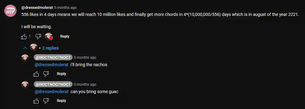
I also found this old comment on a video with way fewer views, where I calculated when it would reach the like goal of 10 million. Because I don't have notifications on, I never noticed that the creator of the video asked me to bring guac for the party in 2221. Glad I caught this now before the party, or it would have been very awkward.
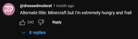
On this minecraft video, I proposed an alternate title which I myself found very funny. Apparently other people did as well, because I have been liked all the way to the top comment. That's pretty cool, even though there are only 200 something comments.
On most of the comments that have replies, at least one is notifying me about the fact that my profile picture indeed resembles the toki pona logograph for soweli, which I think is really fun, because that means that toki pona people exist outside toki pona communities!
This concludes my first blog post on this website, and I now know that writing satisfying conclusions on short texts is hard. Bye!